
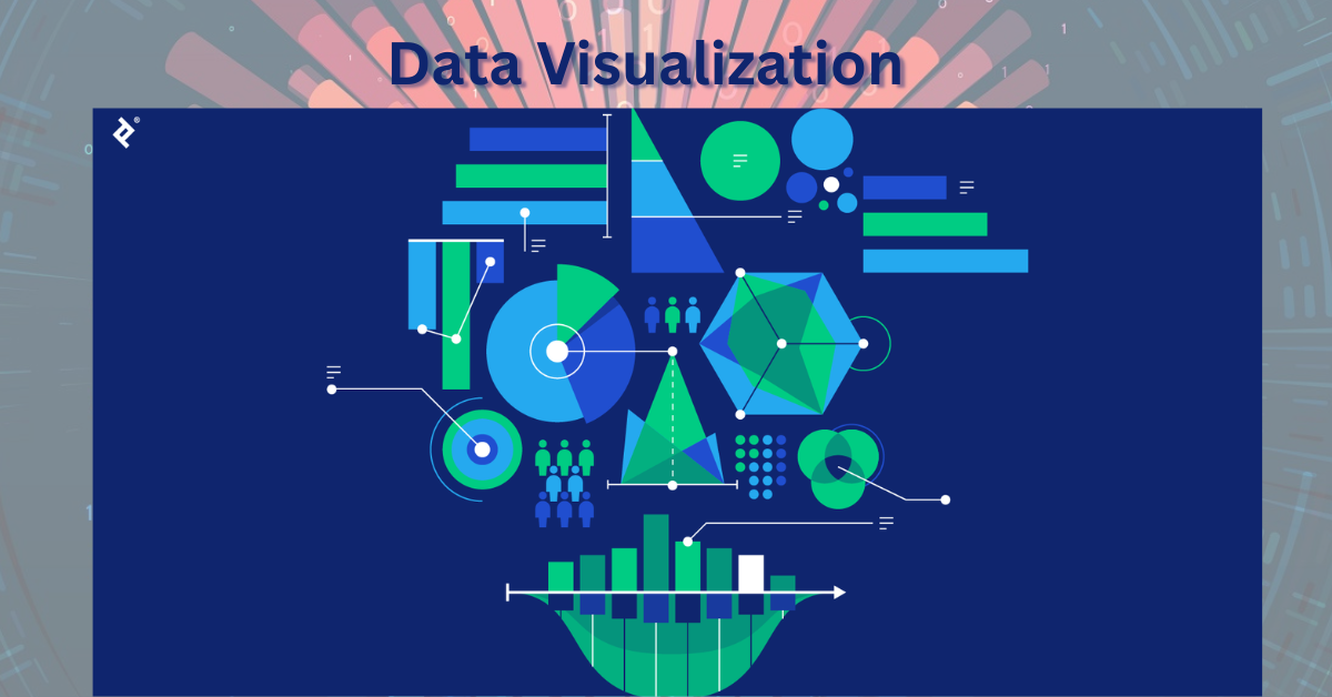
The Ultimate Guide to Data Visualization: Unlocking the Power of Visual Storytelling
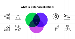
Introduction: What is Data Visualization?
In today’s data-driven world, information is generated at an unprecedented rate. From social media metrics to business performance indicators and scientific research, data is everywhere. But raw data, in its original form, can be overwhelming and difficult to interpret. This is where data visualization comes in—a powerful technique for transforming complex datasets into visual formats like charts, graphs, and maps, making the information easier to understand and act upon.
Data visualization is not just about making charts. It’s about telling a story with data. When done effectively, it can highlight trends, reveal patterns, and support decision-making in ways that traditional data reports simply cannot.
Why Is Data Visualization Important?
Data visualization plays a crucial role in various sectors such as business, healthcare, education, and government. Here are some key reasons why data visualization is essential:
1. Simplifies Complex Data
Large volumes of data are difficult to analyze using spreadsheets alone. Visual representations like bar charts, heatmaps, and scatter plots make data easier to interpret.
2. Identifies Trends and Patterns
With the right visualization, you can quickly spot trends, correlations, and outliers. This is essential in forecasting, resource allocation, and strategic planning.
3. Enhances Decision Making
Clear visuals support faster, more informed decisions by highlighting key insights at a glance.
4. Encourages Data-Driven Culture
When data is visual and accessible, more team members are likely to engage with it, promoting a culture of data literacy across the organization.
Types of Data Visualization
There are various ways to represent data visually, and the best choice depends on your data and what you want to communicate. Here are some of the most commonly used types:
1. Bar Charts
Ideal for comparing quantities across categories. For example, sales performance by region.
2. Line Graphs
Perfect for showing trends over time, such as website traffic growth.
3. Pie Charts
Useful for displaying proportions or percentages within a whole.
4. Scatter Plots
Great for identifying correlations between two variables.
5. Heatmaps
Show intensity of data points using color, commonly used in website analytics and financial modeling.
6. Histograms
Display the frequency distribution of a dataset, particularly useful in statistical analysis.
7. Area Charts
Similar to line graphs, but with the area below the line filled in, making them useful for showing cumulative totals.

Popular Data Visualization Tools
Thanks to advancements in technology, a wide variety of tools are available to help users at any skill level create stunning visualizations. Here are some of the top data visualization tools:
1. Tableau
Known for its powerful drag-and-drop interface and interactive dashboards, Tableau is widely used by data analysts and business intelligence professionals.
2. Power BI
Microsoft’s business analytics tool that integrates well with Excel and Azure, ideal for enterprises already using Microsoft products.
3. Google Data Studio
Free and user-friendly, it allows you to connect various data sources and create shareable reports.
4. D3.js
A JavaScript library for creating custom, interactive visualizations on the web. Best for developers with coding experience.
5. Looker (Google Cloud)
Enables data exploration and visualization within modern BI workflows.
6. Qlik Sense
Offers associative data modeling and responsive dashboards, suitable for advanced analytics needs.
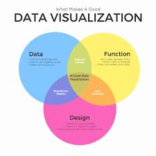
Data Visualization Best Practices
Creating effective data visualizations is both a science and an art. Here are some best practices to keep in mind:
1. Know Your Audience
Tailor your visuals to the background and expectations of your audience. A finance team may prefer detailed charts, while executives might want high-level dashboards.
2. Choose the Right Chart Type
Avoid forcing data into a chart that doesn’t represent it well. For instance, pie charts are not ideal for complex comparisons.
3. Keep It Simple
Avoid clutter by removing unnecessary design elements. A clean design enhances readability.
4. Use Color Strategically
Colors can direct attention, highlight important points, and represent data categories—but overuse or poor contrast can be distracting.
5. Tell a Story
Visualizations should lead viewers through the data, emphasizing key takeaways and supporting your message.
The Role of Data Visualization in Business Intelligence
Business intelligence (BI) tools rely heavily on data visualization to help organizations monitor performance, optimize operations, and forecast future trends. Here’s how visualization supports BI:
- Real-Time Dashboards: Help teams track KPIs instantly.
- Trend Analysis: Visual tools make historical data easier to analyze for future strategy.
- Decision Support: Executives can base strategic decisions on visual insights without diving into raw data.
Data Visualization in Big Data Analytics
Big data refers to extremely large datasets that require advanced tools to process and analyze. Visualization in this context plays a vital role by:
- Making massive datasets more comprehensible.
- Supporting machine learning model explanations.
- Helping uncover hidden insights across multiple data sources.
With visual analytics, organizations can explore big data more intuitively, identifying trends and insights that wouldn’t be visible in raw numbers.
Real-World Applications of Data Visualization
Let’s explore how different industries are using data visualization:
1. Healthcare
- Monitoring patient vitals in real-time.
- Tracking the spread of diseases (e.g., COVID-19 dashboards).
2. Finance
- Investment portfolio performance dashboards.
- Risk analysis using heatmaps and histograms.
3. Marketing
- Campaign performance dashboards.
- Customer behavior analysis using funnel charts and flow diagrams.
4. Education
- Tracking student performance and engagement.
- Curriculum effectiveness based on feedback and results.
5. Government
- Census data representation.
- Urban planning through geographic mapping.
The Future of Data Visualization
As technologies like AI and machine learning evolve, the future of data visualization is becoming more dynamic and predictive.
1. Interactive Dashboards
Users can filter data, drill down into details, and generate custom views in real-time.
2. Augmented Analytics
AI-driven analytics can automatically generate visual insights, helping non-technical users understand complex datasets.
3. Mobile-Friendly Visuals
With mobile device usage increasing, data visualizations are being optimized for smaller screens.
4. Real-Time Data Streams
IoT and real-time applications require visualizations that can update dynamically as new data comes in.
Common Data Visualization Mistakes to Avoid
Even the best tools can’t make up for poor design choices. Watch out for these common pitfalls:
- Using the wrong chart type
- Overloading visuals with data
- Ignoring data accuracy
- Poor labeling or unclear axes
- Bad color choices that confuse rather than clarify
How to Learn Data Visualization
Want to get started with data visualization? Here’s a roadmap:
1. Understand the Basics of Data Analysis
Know how to interpret data and draw conclusions.
2. Learn Visualization Tools
Start with user-friendly tools like Google Data Studio or Tableau, then explore advanced ones like D3.js if you want custom visuals.
3. Study Real-World Examples
Explore dashboards from top companies or public datasets to see how visualization is applied effectively.
4. Practice Regularly
Use sample datasets or take on freelance projects to improve your skills.

Conclusion: The Power of Visual Data
In a world overwhelmed with data, the ability to present information clearly and compellingly is invaluable. Data visualization bridges the gap between raw data and actionable insight. Whether you’re a business leader, marketer, analyst, or student, understanding how to visualize data can empower you to make better decisions, communicate more effectively, and ultimately drive success.
From pie charts to predictive dashboards, data visualization is no longer optional—it’s essential.

I am passionate about helping businesses grow their online presence and achieve measurable results. Let’s connect and discuss how I can help you reach your digital marketing goals!